Project Management
Burndown and Burnup Charts: What's the Difference and How to Use Them
Your client calls you out of the blue and leads with ‘so how's our project coming along?’ You shuffle through reports, scroll through emails, cover the mic and ask your neighboring coworker, and unconfidently reply ‘right on schedule!’ with a slight grimace on your face.
We’ve all been there.
But what if you had the tools right in front of you to answer quickly and confidently? Would it be worth it to you if all you had to do was update a graph or two throughout the lifecycle of the project?
Even better… What if the process for updating that graph (or two or three…) was automated?
These tools are known as burndown and burnup charts. We’re going to discuss the differences between the two and how they can be implemented into any project management process, preventing you from being caught off guard again.
Why It’s Important to Measure Project Success
Ask any project manager and he or she will tell you that one of the most common challenges in project management is determining whether or not a project is successful.
But "successful" can mean different things to different stakeholders, right?
According to the Project Management Body of Knowledge (PMBOK) Guide, Sixth Edition, traditionally, the most common project management metrics are as follows:
- Time
- Cost
- Scope
- Quality
However, as the practice and principles of project management have evolved over time, experts and practitioners believe that there are other factors that go into what makes a project “successful”. These include:
- Completing and understanding project benefits
- Meeting the agreed-upon financial measures documented in the business case
- Net present value (NPV)
- Return on Investment (ROI)
- Internal Rate of Return (IRR)
- Meeting desired business impact or objectives
- Completing movement of an organization from its current state to the desired future state
- Fulfilling contract terms and conditions
- Meeting organizational strategy, goals, and objectives
- Achieving stakeholder satisfaction
- Acceptable customer/end-user adoption
- Integration of deliverables into the organization’s operating environment
- Achieving agreed-upon quality of delivery
All in all, before kicking off any new project, release, or initiative, there are three questions that the key stakeholders and the project manager should answer:
- What does success look like for this project?
- How will success be measured?
- What factors may impact success?
If you and your team define project “success” as releasing deliverables within planned sprints or increasing the speed or velocity during each sprint, then using burn charts can help you visualize project progress.
Measuring the success of your project is vital to any company or team looking to grow. Implementing tools like burn charts will help you reduce inefficiencies and errors, increase productivity, and eventually open bandwidth for your team to take on larger projects to take your company to the next level.
What is a Burndown Chart?
A burndown chart is a tool used to visualize the amount of work left to complete in a specific project compared to a set deadline or due date, or to show how quickly a team is moving toward a goal.
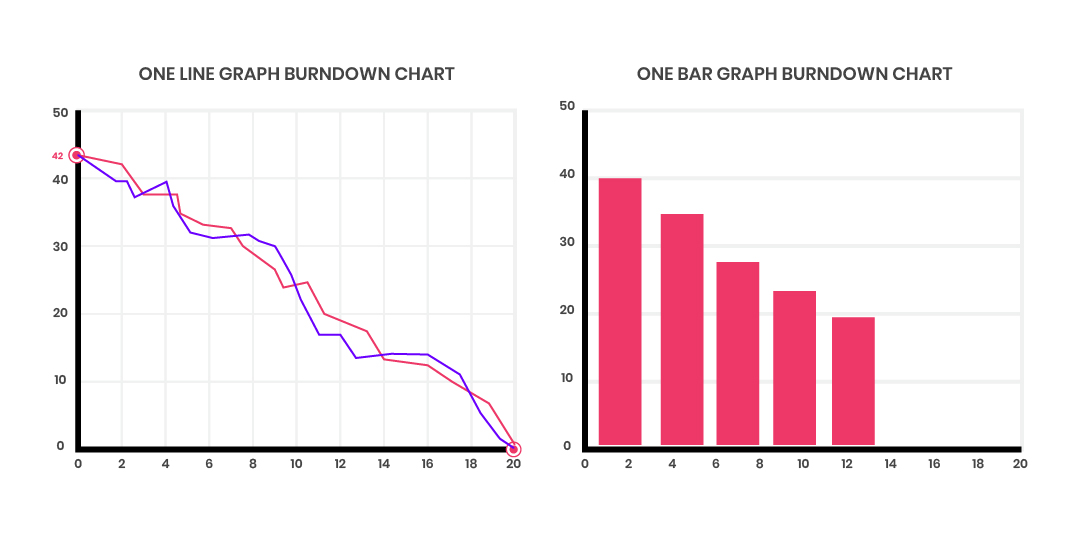
Burndown charts can be used to measure “the amount of work” in “story points” or “ideal days”, regardless of the agile estimation method your team uses. Burndown charts can be expressed in a line chart or a bar graph. Listed along the vertical axis shows the remaining work and the horizontal axis reflecting the remaining time for the project. As the line moves across the horizontal axis (elapsed time), the amount of remaining work should be decreasing.
Think of a burndown chart like flipping over an hourglass. As the number of hours put into completing a task or project passes, you can also see how much is remaining.
How and When to Use a Burndown Chart
One of the best things about using a burndown chart is that it can easily communicate the following:
- Actual velocity or speed of the entire team
- Estimated speed per sprint
- Total work complete at each point in time
- Remaining tasks versus time remaining
Burndown charts also make it easy to communicate delays to the client or stakeholder. Since a burndown chart will help project leaders anticipate delays, this allows them to be more proactive in making any adjustments to mitigate these risks.
What is a Burnup Chart?
Burnup charts are used to track how much of a specific project has been completed within a given time. Also visualized through a line graph, a burnup chart utilizes two lines: one line across the top represents the work that needs to be done, and the second line runs parallel along the bottom gradually trends upward as sprints or iterations of work are completed.
A burnup chart is more like taking a road trip and following a GPS. The end goal stays in place, while the miles you traveled gradually bring you closer to your original ETA. It can also track any roadblocks or speed bumps you’ve encountered along the way.

How and When to Use a Burnup Chart
Though slightly more complex, burnup charts are also relatively straightforward. Also used to measure the progress of an agile project, project leaders can create burnup charts and update them as each sprint and iteration is completed.
Burnup charts allow project leaders to see:
- The number of overall tasks completed
- The amount of time each task took to complete
- If a project is on time
- Work that is added to the scope or into an existing sprint
Burnup charts also represent how much of the work is already done in comparison to what was originally planned. Burnup charts are a good tool to use if there’s a chance that the scope of the sprint will change. This allows teams to re-evaluate whether or not the additional work being added to the sprint is worth delaying release dates.
The Differences Between Burndown and Burnup Charts
Both charts are useful tools in an agile workflow to measure project progress. However, there are some key differences between the two:
Burndown Charts:
- Show the total amount of work for a project and gradually decline until there is nothing left for the team to complete in each iteration, release, or the project as a whole
Burnup Charts:
- Reflect the amount of time/work done to reach a 100% completion rate
- If work is added in the middle of the project, you can show where that occurred, and how the additional work impacts the timeline
In short, if you want to understand what is left to be completed, then use a burndown chart.
If you want to highlight the work that has already been accomplished, then use a burnup chart.
What Are the Benefits of Burn Charts?
Providing accurate information to all project stakeholders is crucial in any project. It’s an easy way to build trust, show your team's productivity, and measure project success.
With both of these charts, you have accurate information on hand to show your team where they might need to pick up the pace and where they are excelling. Burn charts are also useful in communicating overall status to the entire project team. You can also think of burn charts as your project team’s “score board”.
Build Burn Charts with Rindle
Of course, you can draw out burn charts by hand, but why would you if you had a robust and reliable tool to do it for you? Rindle allows you to create and maintain burn charts in-app, and through the lifecycle of your project. With Rindle’s customizable, no-code interface, you can create these charts and begin tracking your team's progress in minutes.
Visit Rindle for a free trial today!